July 16, 2026
The crest is sacred — and alive
Napoli and Fiorentina turn 100 with infinity on the shirt, Augsburg's Roman marble, Venezia back on track, a spiral ball and Pokémon in Japan. The week in sports design through the magic eye.
MAGO'S TAKE
The crest is sacred. That's exactly why it changes.
Magos e Fadas, sit down — this one's a long talk, and a good one.
Fans have a curious relationship with change. New manager? Debate. New signing? Judgement. New shirt? Complaints… then a purchase. But touch the crest? That's family business. That badge is tattooed on the chest.
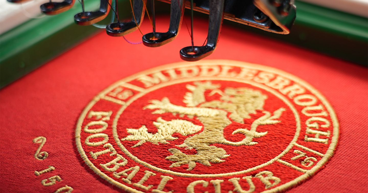
Except all of Europe decided to poke that wound at once. Middlesbrough redrew their badge for their 150th year. Salford unveiled a new mark and brought back orange as the first colour. Sporting launched an entire identity system for their 120th. Marseille rebuilt their brand in-house. And West Ham — note this — opened a fan consultation BEFORE drawing a single line.
Here comes the stat that kills the myth. When Boro consulted more than 21,000 supporters about the redesign, guess what: 57% in favour. Only 19% against. Fans aren't against change, Icon. They're against BAD change. The loudest crowd online isn't the fanbase — it's the slice of the fanbase with wi-fi and free time.
Look at the ones who got it right: Sporting didn't invent a new lion — they went back to the 1940s lion and sharpened the line, keeping even the nod to the stadium's Porta 10-A. Boro hid the River Tees and Roseberry Topping INSIDE the lion. Stoke resurrected the 1977–92 crest, Staffordshire knot and kiln included — two-thirds of the fans approved. That's not erasing history. That's editing: cut the excess, keep the soul.
Mago's read: a crest no longer lives only on the shirt. It's an Instagram avatar, a TikTok profile, a gaming asset, a shop window, a stadium screen. Hundreds of surfaces that didn't exist when most of these symbols were drawn. Clubs don't design for the Sunday match programme anymore — they design for culture.
Some fans hear that and shiver: 'we became a fashion brand'. Easy. It's not about becoming a label — it's about clarity. The most recognisable marks on the planet work at any size, favicon to façade. Football joined that game. And in that game, standing still is the real risk.
And the detail nobody says out loud: the crests we defend with teeth and nails today… were also redesigns once. Nothing is born tradition. Tradition is the drawing that survived long enough to mean something.
Tradition isn't museum glass, Magos e Fadas. It's a living current. And you don't freeze a living current — you polish it.
CENTENARY WEEK
Napoli & Fiorentina: 100 years, two shirts, one infinity.
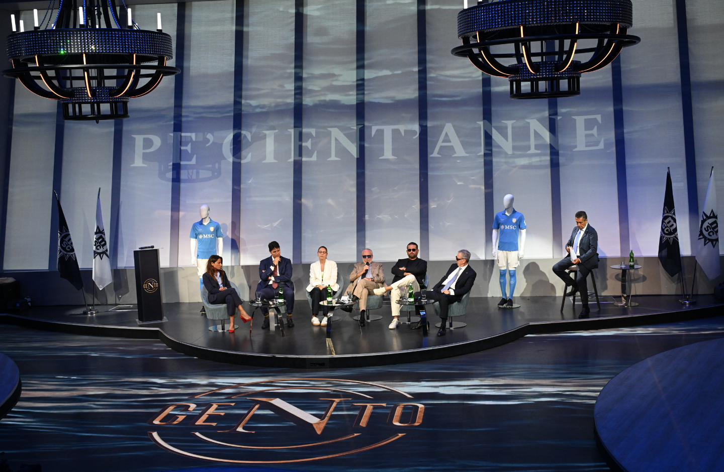
Yesss, sir. Two Italian giants blowing out 100 candles in the same summer. And when I opened both launches side by side, one detail gave me chills: both put the infinity symbol on the shirt. Without agreeing on it.
Napoli first. The centenary shirt comes in a shade christened Centenary Blue — not the usual sky blue: it's a direct rereading of the WOOL shirt from the first scudetto, that eighties one that itched your arm and won games. The technical fabric simulates the wool pattern in jacquard. That's telling history with thread, not with speeches.
On the heart, the celebratory crest stacks four symbols: the Steed of the Sun — the club's FIRST symbol, chosen in 1926 by president Giorgio Ascarelli —, the number 100, the infinity sign and the current badge. On the neck, embroidered, 'Partenopei'. And there's tech hidden in the authenticity patch: an NFC chip. Tap your phone, the shirt opens exclusive content. The shirt became owned media, Maestro.
Now Florence. Fiorentina pulled the riskiest birthday move: changing technical partner AFTER an entire era with the previous brand, precisely in the centenary year (29 August 1926 — 29 August 2026). Heavy bet. It came out beautiful.
The home is deep viola with a tonal geometric pattern woven across the torso — diamonds, interlocking lines, tile shapes that look lifted from a Florentine palazzo floor. On the chest, the stylised '1926–2026'. Sober, artisanal, Italian to the last stitch.
But the crown jewel is on the white away. Flip the collar and you find a '100' drawn in a way that, at second glance… is the infinity symbol. Napoli's same trick, hidden elsewhere. A tailor's easter egg.
When two centenaries point to the same symbol without talking, it's not coincidence — it's dressing-room semiotics. Both clubs understood you don't celebrate 100 years looking back: you celebrate promising it doesn't end. Club love has no expiry date.
If I had to pick one for the shop window? Napoli wins on storytelling. Fiorentina wins on touch. Technical draw — the collector's wardrobe will have to cope.
X-RAY OF THE WEEK
Augsburg x Mizuno: the shirt that became Roman marble.
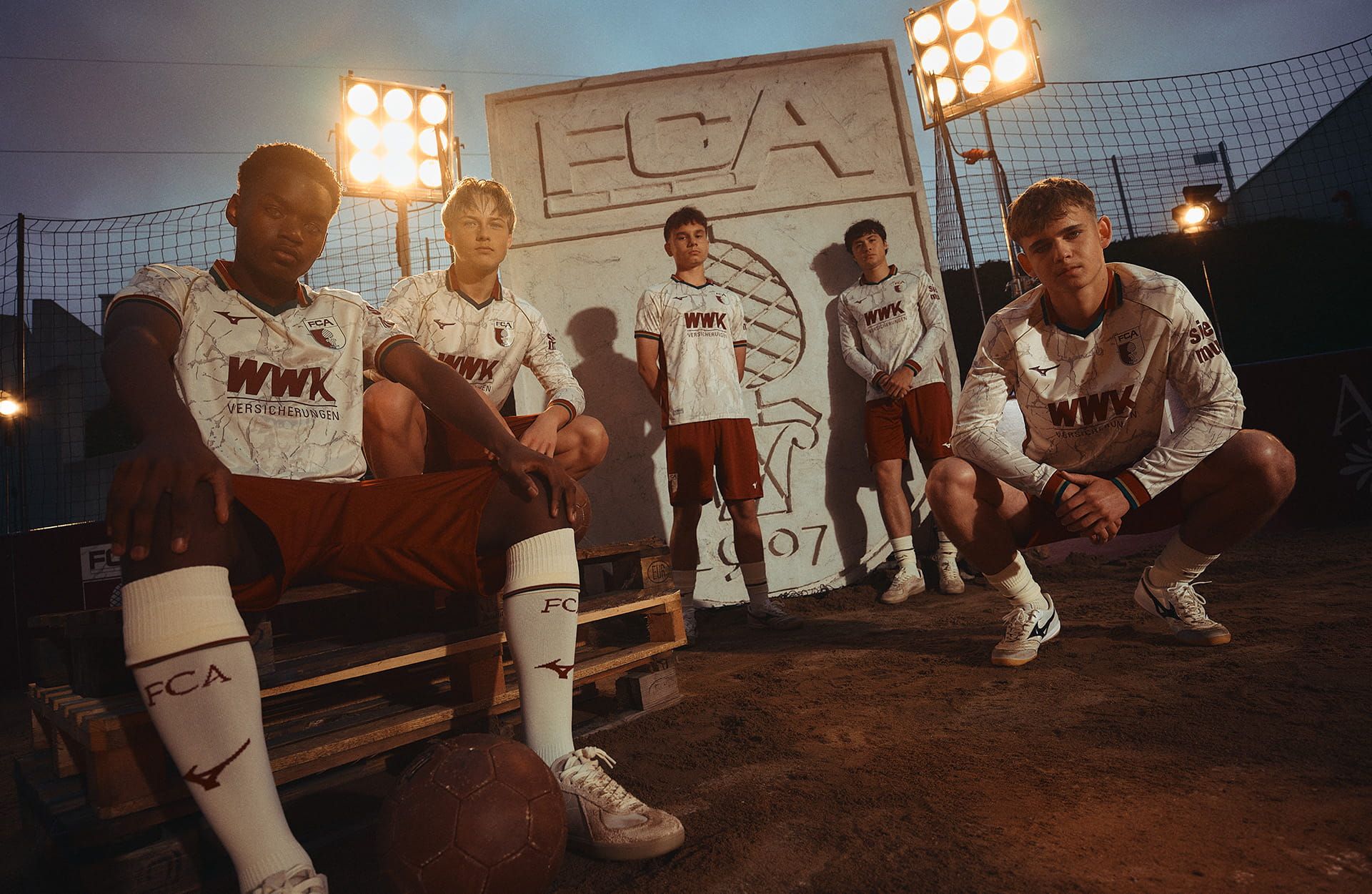
Magos e Fadas, guardem essa data: o candidato a camisa da temporada 26/27 chegou em pleno julho. E não desceu de um ônibus de gigante — desceu em Augsburg, clube de meio de tabela da Bundesliga que virou, ano após ano, a vitrine mais afiada da Mizuno na Europa.
Existe camisa 'inspirada na história' e existe camisa que FAZ o dever de casa. A primeira vira fantasia de festa temática. A segunda vira patrimônio. Essa aqui é do segundo time — e eu vou te mostrar o porquê, detalhe por detalhe. Viene con me.
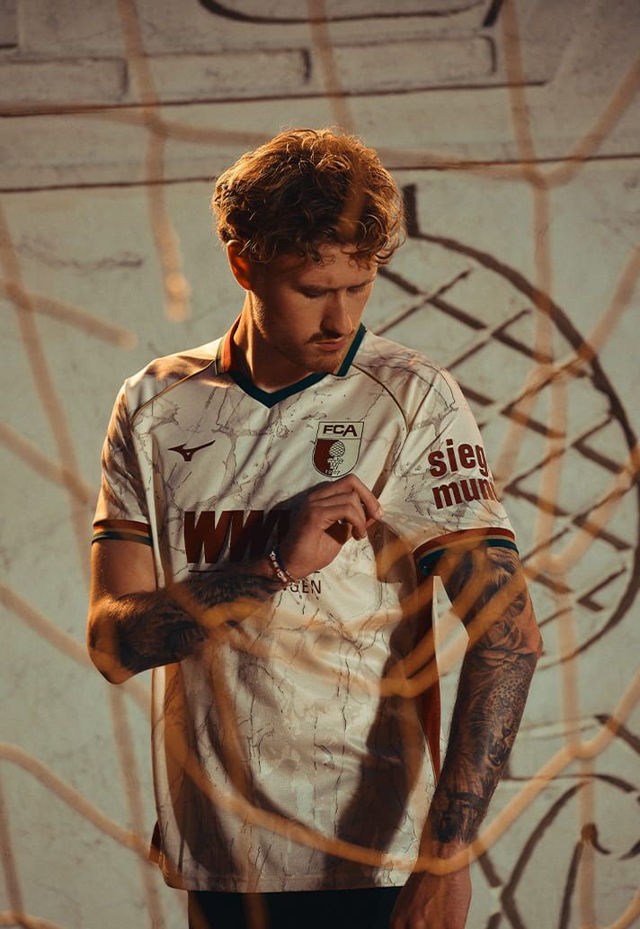
Primeiro choque: a base é creme. Num campeonato dominado por branco chapado, vermelho de marca e preto utilitário, um creme quente já te tira do piloto automático. Mas a mágica acontece quando você chega a um palmo do tecido: um grafismo de mármore toma a camisa inteira, com veios em borgonha e verde escuro correndo como rio dentro da pedra.
E aqui entra a camada de história que me ganhou. Augsburg não é uma cidade qualquer: foi fundada pelos romanos há mais de dois mil anos, no tempo do imperador Augusto — Augusta Vindelicum, o nome antigo, é literalmente a certidão de nascimento da cidade. O mármore da camisa não é estampa aleatória de moodboard: é o chão do império onde o clube pisa até hoje.
Um conceito desses podia facilmente derrapar. Coroa de louros, coluna grega no peito, numeral latino gigante — a linha entre homenagem e carnaval é fina. A Mizuno segurou a régua: o mármore é sutil, quase um segredo que só aparece de perto. Camisa que fotografa bem de longe e conta história de pertinho é camisa de colecionador.
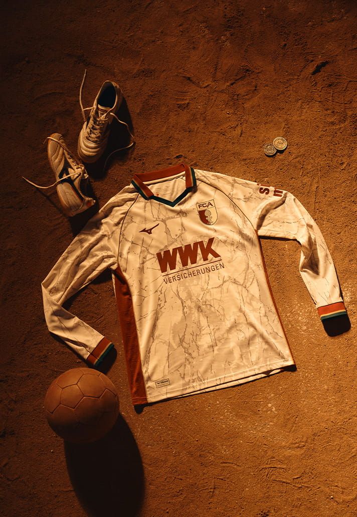
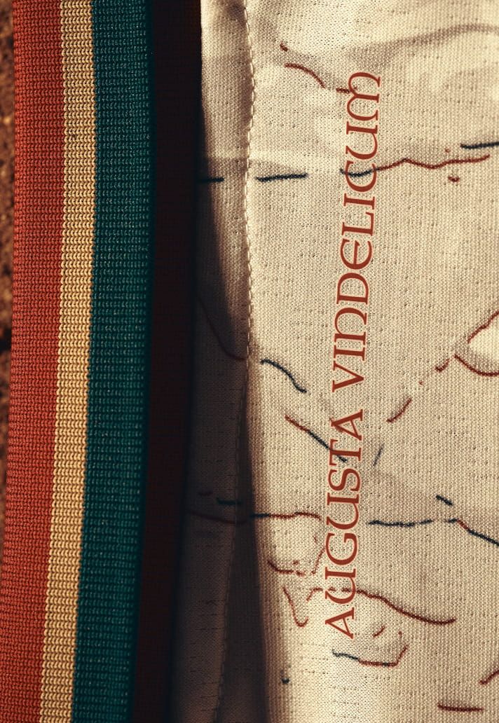
Os detalhes seguram a tese um por um. Piping dourado emoldurando a construção, como moldura de afresco. Gola e punhos com acabamento nas cores tradicionais do clube, costurando o antigo com o atual. E nos painéis laterais, em relevo discreto, pinhas romanas — quem conhece Augsburg sabe: a pinha é o símbolo histórico da cidade, presente até no brasão. Storytelling em baixo-relevo.
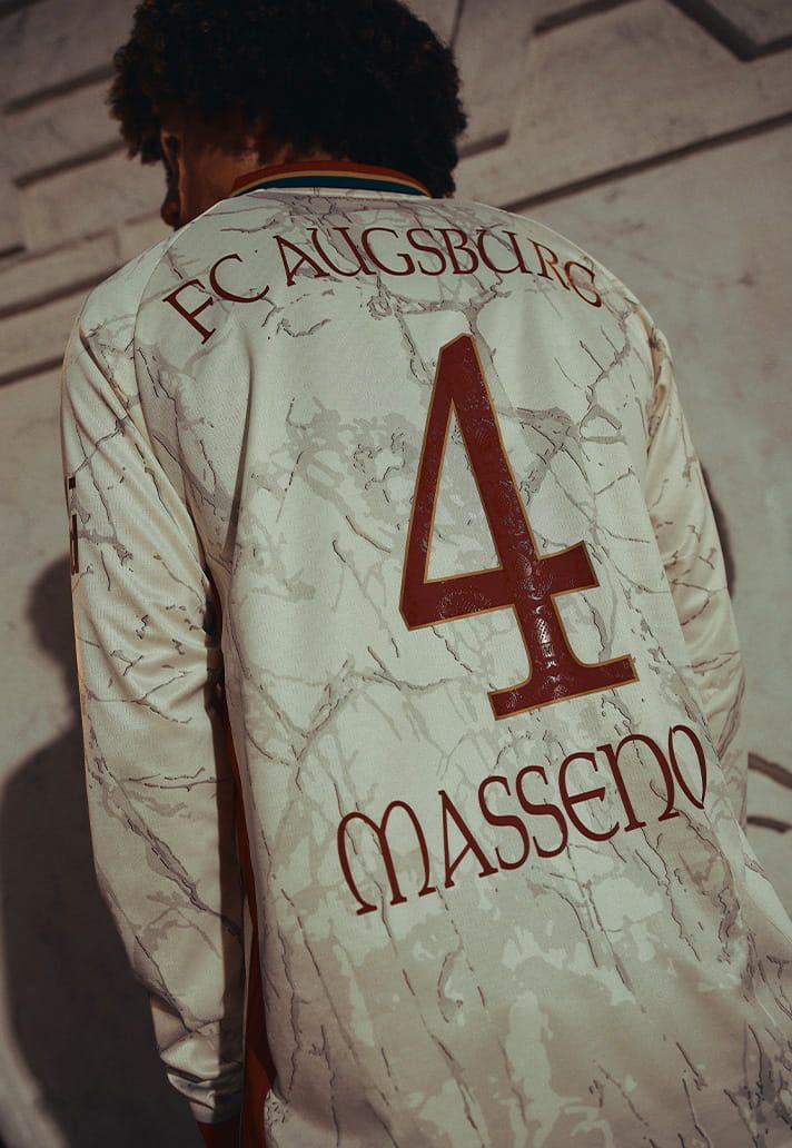
Vira a camisa e o requinte continua: abaixo da gola, a assinatura 'Augusta Vindelicum' bordada, tipo dedicatória de artista. E a numeração é customizada, com traço inspirado nas inscrições das colunas romanas. Até o número do camisa 9 vai contar história correndo pro gol.
Agora, a decisão mais corajosa do projeto — e presta atenção porque é aula: foi uma decisão de TIRAR. Escudo, logo da Mizuno e patrocínio aparecem monocromáticos, num vinho escuro que quase se dissolve no fundo. Ninguém compete com o mármore. Num mercado onde todo lançamento grita, o Augsburg sussurrou.
A leitura do Mago: contenção é a forma mais cara de luxo. Quanto mais um clube confia na própria história, menos precisa gritar — e o Augsburg confiou tanto que deixou dois mil anos falarem por ele. É a mesma lógica da alfaiataria: o terno bom não tem etiqueta pra fora.
E não é acaso, Magos e Fadas. Essa parceria Augsburg x Mizuno vem emendando acerto atrás de acerto — de camisa desenhada com a torcida a terceiro uniforme celebrando a herança romana. Tem clube grande gastando dez vezes mais pra ter metade dessa identidade.
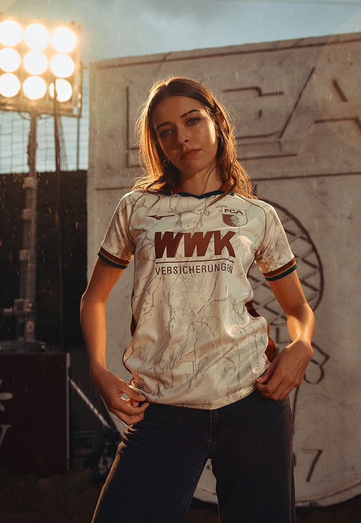
Uma marca japonesa contando dois mil anos de história bávara com maneirismo de alfaiate italiano. Futebol global no estado da arte. A camisa já está nas lojas — e a minha aposta tá feita: essa briga o prêmio de manto da temporada até o fim. Strepitoso, siiim senhor.
DROPS OF THE WEEK
Venezia finds its rhythm, West Ham keeps it classic.
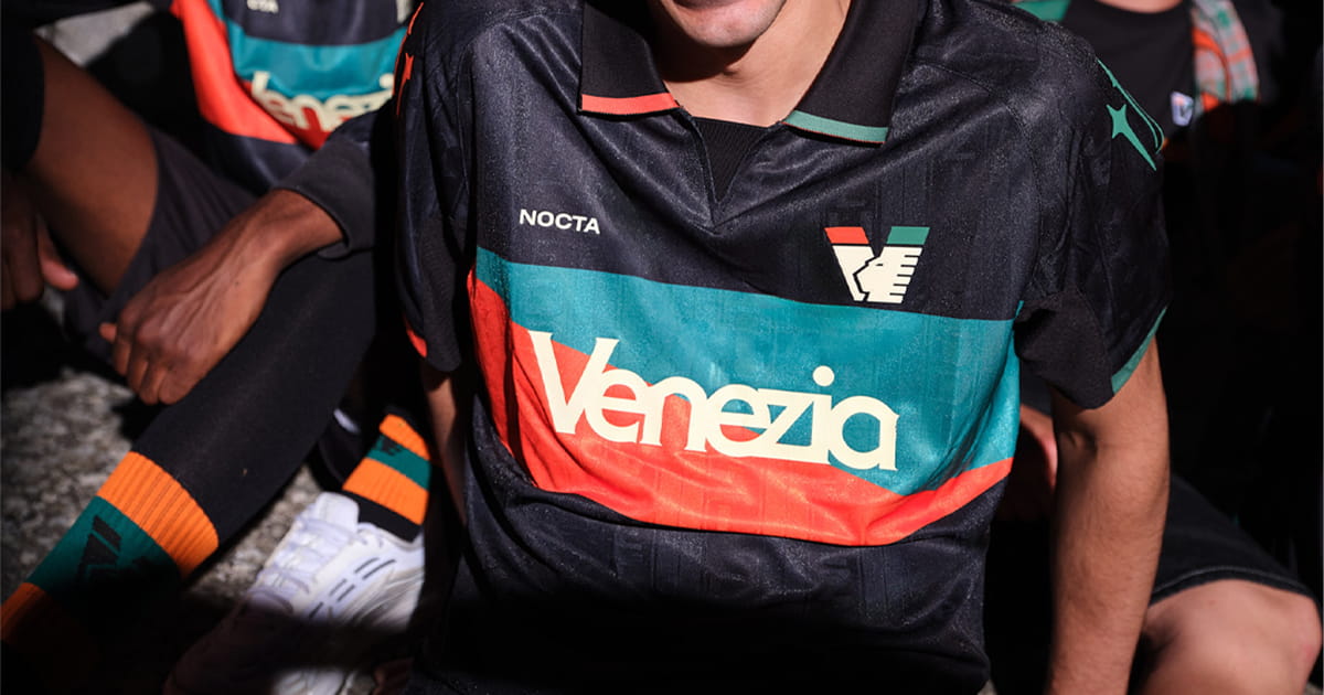
Replacing a golden era is like replacing a title-winning manager: the successor gets beaten up for not being the old one. Venezia lived that. When the previous era ended, I myself suspected the golden years of Italy's most stylish club were behind them. The new phase's first collections were… correct. Fine execution, zero magic.
The 26/27 home changes the conversation. Black base, and cutting across chest and back, two wide bands: orange and green. The club's colours raw, unfiltered, inspired by the flags rippling in the Curva on matchday. Two-tone ribbed polo collar, elevated cuffs, sharp silhouette.
What really changed? The collab stopped trying to prove it's cool and let Venezia be Venezia. Black, orange, green. Simple. Elegant. Unmistakable. The return to Serie A comes with the clarity that made this club the world's design darling — and this time the partnership works FOR the club, not on top of it.
Over in London, West Ham did their homework: the 26/27 home lands in the usual claret and blue, honest finishing, no fuss. And note the coherence: the same club consulting its fans about the crest's future releases a shirt that scares nobody. Tidy the house before debating the façade.
Collector's quick round: Leverkusen put the new shirts in the window, Valencia dropped the third and Benfica presented the 26/27 away. Full wardrobe week, crying wallet.
OFF THE CURVE
A spiral ball and Pokémon in Japan.
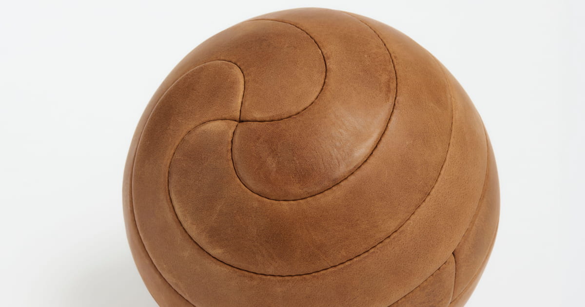
Some people look at a ball and see a ball. Others look and ask: what else can this be?
A designer obsessed with ball construction spent years answering his own audience's requests — and the champion request was always the same: 'make a spiral ball'. The experiment became a video, the video went viral with 6 million views. Now it's an object: first-grade Italian leather, hand-stitched, with only EIGHT identical J-shaped panels that curl into each other until the sphere closes itself. Perfect spiral, Euler mathematics, a run of 200 numbered units.
Each prototype took days. Six leather versions and countless paper ones before the geometry clicked. And the result has that good-design magic: everyone projects something — some see soft-serve ice cream, some a hurricane, a fingerprint, a seashell.
In a World Cup final, billions of people stare at the SAME object at the same time. And still someone finds a new way to design it. The ball is world design's most democratic canvas.
And on the other side of the world, Japan taught an activation masterclass: the league partnered with Pokémon — turning 30 — under the theme EVOLUTION, celebrating the league's own 'evolution' as it moves its calendar to August. The genius move: each of the 60 clubs got an EVOLVED Pokémon as official partner. Sixty collabs inside one.
It comes with 1 million recycled eco bags gifted to fans, Pokémon GO events at the stadiums and Pikachu as mascot-in-chief. Pop culture and football on the same team — the way we've preached here since 2017.
Educate, inform, entertain — Japan did all three in a single move. Hats off, yesss sir.
TO CLOSE
Bora de Publi?
If this issue made you look at shirts differently, do the basics: send it to that collector friend. The share button is right there.
Want your brand here, between a centenary crest and Roman marble? Let's talk.
And follow me on Instagram: @equartafeira. Viene con me.
Bacio do Mago, Piacere, Ciao!
How was this issue?
Olho Mágico®